Sketch time! AKA Figure out the game plan.
Layers.
I like to approach all of my art projects in layers. It is easier for me to conceptualize and plan in layers.
As I mentioned in the previous post of this series, I had a notion of hidden feelings and planned to symbolize the mood or personality that is hidden behind the facial expression in a picture.
These hidden emotions can be the first layer, or the background layer, of my painting.
2nd Layer.
I also gravitated towards the idea of separating and detaching the face and expression. Immediately, I think of a technique I used in a previous art project.
It was a family portrait that was requested as a gift. It also was the first artwork I created right out of college.
Unfortunately, the only photo I have of this artwork isn’t the greatest quality. But it’s good enough to show you how I used outlined visages in the foreground (painted using shades of blue) and realistic depictions in the background (painted using shades of orange).

Family Portrait of the Vasquez-Caruthers family. Acrylic paint on canvas. 2013
This face outline will be the second layer of my self-portrait painting.

Photo of my brainstorm page in my sketchbook.
For this art project, I think two layers might be all that is needed to achieve the goal of creating an abstract self-portrait.
However, I like to have options to consider. I might want to somehow incorporate the context or location of the photograph that I end up using.
This additional layer would be a subtle detail layer.
For now, I’ll leave it at the two layers (discussed above) and revisit this third detail idea later.
So, next I need to choose the picture that will inspire me.
There are two routes I can go. I could take a picture of myself right now and have a self-reflection session of sorts.
Or, if I really want to maximize a self-reflection session, I can wait until I feel a strong emotion like anger or frustration and take a picture then. The hidden feelings would be that anger, while my facial expression could be neutral.
The other option would be to look through photos of myself and find a picture where my facial expression does not convey what I’m feeling at that moment in the picture.
For whatever reason, I like the idea of finding a memory with a hidden feeling more.
And now, for the photo I have chosen.
The memory with the hidden emotions.
Here is the picture that has filled me with the inspiration I need to complete an abstract self-portrait:

Hahaha, I really don’t know how to describe that facial expression I am making.
(I don’t like taking photos; can you tell?)
It’s somewhere between a moody duck face and a stink eye. I really don’t know.
What I do know is that I am not smiling in this picture, even though I was having an awesome time.
The photo was taken during a very invigorating hike in Hawaii. At that point in time, I had recently made some major life decisions and changes, and that hike allowed me to reflect and affirm that I was on the right path for myself.
My silly facial expression definitely does not portray any of the emotions that I remember from that hike. This photo has all the criteria I need for my abstract portrait idea of hidden feelings.
Okay, onwards to designing the background layer.
Layer 1: Background — Hidden Feelings
In my sketchbook, I write out the emotions I remember from that moment captured by the photograph.
I remember feeling happiness.
I was experiencing rapid changes, but it felt like a ‘good’ sort of chaos.
It was a moment of reignited passion, renewed energy, and finding a new fuel and drive.

Photo of my brainstorm page for Layer 1 in my sketchbook.
You may be thinking ‘rapid changes’ is not an emotion!
Well, for me, ‘rapid changes’ is a phrase that represents a set of emotions like anxiety and nervousness.
And when I combine the phrase ‘rapid changes’ with the phrase ‘good chaos’, I get a sense of excitement and positivity.
In my head, using phrases to represent a set of emotions works for me. When making art, you do you!

As you can see in the sketchbook excerpt above, I used color pencils to highlight words.
I am associating a color with each emotion or set of emotions.
The choice of which color for each emotion is arbitrary. Perhaps some color associations can be explained.
For example, I grew up in a culture where yellow is often associated with happiness. Another example: when I think of motivation and drive, I think ‘invigorating’. That thought then leads me to thinking about hiking in nature. So, blue and green just make sense to me.
Now that my brain is warmed up and thinking about colors and emotions, I’ll try some paint in my sketchbook to get a feel of the color scheme I’ll be using for my artwork.
Associating colors to my emotions evoked the imagery of a ‘volcano within’. So I decided to explore that a bit further.

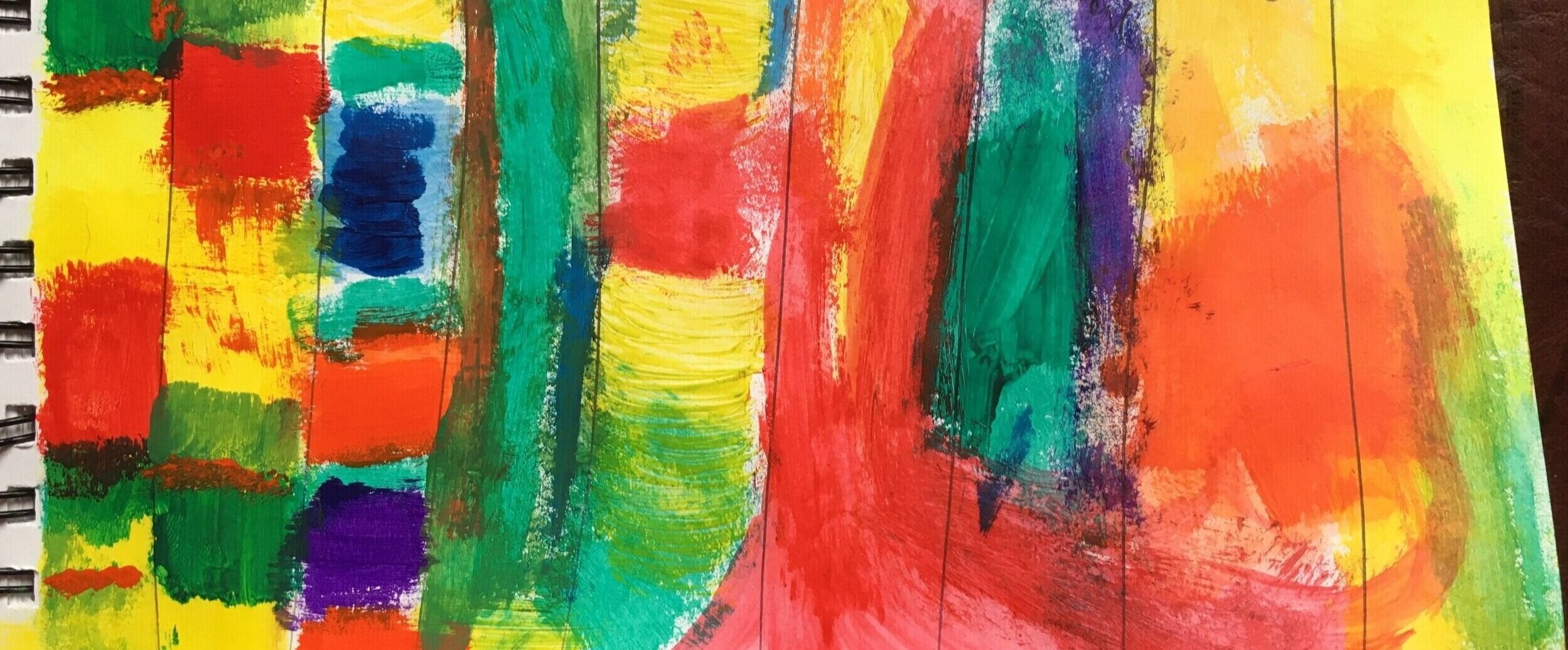
Photo: I created columns and put one emotion or phrase in each column.
I created columns and put one emotion or phrase in each column at the top.
I proceeded to paint the colors I associated with each emotion.
I also wanted to see how the various colors contrasted with each other and visualize different gradients.
While staring at my sketch, the colors that are resonating most with me are yellow, red-orange, orange, and green-blue.
I also like the idea of using complementary colors to represent the set of emotions I feel when I think of ‘rapid changes’.
Side note: Complementary colors are pairs of colors that create the strongest contrast for those particular two colors when placed next to each other.
Now I want to try out the color scheme in a few background sketches. First, I outline quadrants in my sketchbook to create mini-canvases. By doing this, I can get a sense of proportions and scale from my sketches as well.


Photo of my background sketch.
Keeping:
the energy and movement from the first background sketch, and
the yellow focus of the second
It strikes the balance I am looking for. The effect of the colors and shapes resonate with me.
But before I decide which background layout I want to go with, I need to get a sense of how the next layer looks with the different backgrounds. So let’s move onto sketching the facial expression layer.
Layer 2: Foreground — Facial Expression

Photo of my brainstorm page in my sketchbook for Layer 2.
As I mentioned earlier, I gravitated towards the idea of separating and detaching my face and expression from a photograph of myself. This face outline will be the second layer of my self-portrait painting.


I will use a technique I used in a previous art project to obtain the face outline.
The technique:
Take a digital photo of a person and use a free online tool to obtain the outline of the person’s face.
Use this outline as a stencil to create a really cool effect using just the expression of the person’s face.
Now, I want to get an idea of which background works best for the face/foreground layer.
I also want to see what color options work best for this layer.
Returning to the previous background sketches, I try various colors to see which schemes have the impact I’m aiming for.
Side note: I also want the expression to come across as calm and serene. Based on design theory, cool colors (referring to temperature) are appropriate for evoking calm and serenity.
Source: https://cios233.community.uaf.edu/design-theory-lectures/color-theory/


Photo of my sketch of outlined visage on chosen background.
I like to create as many sketches as I need to get a feel for what I want to commit on the canvas.
Of course, some things may change from my sketches as I complete the final artwork, but at least I will have a starting point on a blank canvas.
Check out the next post, Go! Go! Go!, in which I complete my abstract self-portrait and wrap up this blog series!